
Source code
HTML
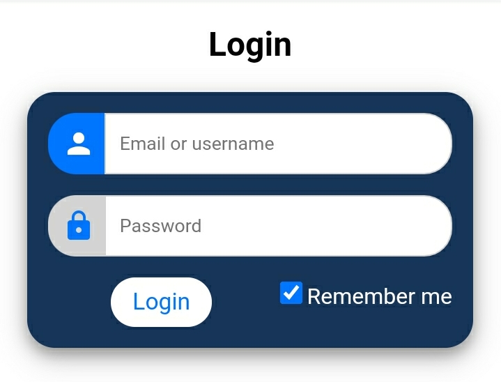
<!Doctype html>
<html>
<head>
<title> Login Page </title>
<link rel=”stylesheet” href=”https://fonts.googleapis.com/icon?family=Material+Icons”/>
<link rel=”stylesheet” href=”gk.css”>
</head>
<body>
<h2 style=”text-align: center”> Login </h2>
<div class=”form-container”>
<form action=”#”>
<div class=”input-cnt”>
<i class=”material-icons”>person</i>
<input type=”text” placeholder=”Email or username” name=”email” />
</div>
<div class=”input-cnt”>
<i class=”material-icons”>lock</i>
<input type=”password” placeholder=”Password” name=”password” />
</div>
<div class=”input-cnt”>
<input type=”submit” value=”Login” />
<div class=”input-cnt”>
<input type=”checkbox” value=”lsRememberMe” id=”rememberMe”> <label for=”Remember me”>Remember me</label>
</div>
</div>
</form>
</div>
</body>
</html>
CSS
* {
box-sizing: border-box;
}
html, body {
margin: 0;
padding: 0;
}
.form-container {
margin: 20px;
padding: 15px;
background: #173459;/* 173459 */
color: white;
box-shadow: 0 5px 10px 0 rgba(0, 0, 0, 0.3), 0 7px 21px 0 rgba(0, 0, 0, 0.20);
border-radius: 20px;
}
.input-cnt {
display: flex; /* display the icon and the input in a line */
margin-bottom: 15px;
}
.input-cnt:last-child {
margin-bottom: 0px;
}
.input-cnt > i {
min-width: 40px; /* set a minimum width for the icon */
padding: 10px; /* make sure the icon is centered vertically */
text-align: center; /* horizontally center the icon */
background: lightgrey;
border-top-left-radius: 20px;
border-bottom-left-radius: 20px;
color: #0076ff;/* 0076ff */
}
/* change styles when focused */
.input-cnt:hover > i {
background: #0076ff;
color: white;
}
/* style the inputs */
.input-cnt > input[type=”text”], .input-cnt > input[type=”password”] {
outline: none;
border: none;
padding: 10px;
border: 1px solid lightgrey;
border-top-right-radius: 20px;
border-bottom-right-radius: 20px;
width: 100%;
}
/* style the submit button */
.input-cnt > input[type=”submit”] {
border: none;
border-radius: 20px;
outline: none;
width: 25%;
margin: 0 auto;
font-size: 105%;
padding: 8px;
color: #0075ff;
background: white;
transition-duration: .5s;
}
/* add a hover effect for the submit button */
.input-cnt > input[type=”submit”]:hover {
color: white;
background: #0076ff;/* 0076ff */
}
.label{
color: #666;
font-size: .875rem;
}
 softwaregyaan.tech.blog